Although I have not decided on my book style, as in which technique it will be made in, I would like to turn my attention toward the book's cover design. A book cover is a highly important thing to think about, in most cases it is what attracts readers, and creates sales
I already know the book will be A4, this is something that I wanted to do from the start of the unit. So I already know the perfect dimensions to work with.
The book cover must reflect the theme that will be present inside the book, so obviously in my case, the cover will be 1950's related in terms of style.
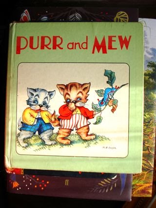
To help me decide a draft for my front cover, I have taken a few example front A4 covers from a random assortment of c1950 children's books. I will display them below, and then write a summary below each one.
 |
| http://image0-rubylane.s3.amazonaws.com/shops/antiquebeak/ab6901.1L.jpg?43 < image reference at this link. |
 |
| http://specificflavour.typepad.com/.a/6a013488b4d7b8970c014e60b1d2a0970c-320wi < image reference at this link. |
 |
| http://thumbs3.ebaystatic.com/d/l225/m/mu9IXWC4yEZwn8li92jARow.jpg < image reference at this link |
ySdEoBQ9CsGpjRw~~60_35.jpeg) |
| http://i.ebayimg.com/00/s/MTQwMFgxMTIy/$T2eC16JHJGwE9n)ySdEoBQ9CsGpjRw~~60_35.JPG?set_id=880000500F < image reference at this link. |
 |
| http://media-cache-ec0.pinimg.com/236x/0e/f4/d9/0ef4d954e329d719669201a4aa9ac239.jpg < image reference at this link. |
-----------------------------------------------
Research review:
- In all of the examples I have displayed, the main text body seems to be at the top of the book. This is interesting, so I will reflect on this by placing my book title at the top of the book. there are many different fonts that each over uses, but one that stands out to me most, is the top one. This font type is very very similar to the times new roman font of today. However this text type is too bland for my liking, so I will try to emulate a different style. I will research font in a later blog, and go from there.
- I have also noticed that most of my example book illustrations are roughly centred. I will emulate this by placing my book cover illustration, in the middle of the front cover page.
After going over my research, I have come up with a draft, that I could use as a basis for my book cover design. (Below)
.JPG)
I took into account a common theme, by seeing what was common in my random examples, and putting together a draft of what I could do for my front cover. I think it reflects 1950's children's books well, and I am looking forward to adapting on this.
Thomas.
No comments:
Post a Comment