Showing posts with label children. Show all posts

Wednesday, 8 January 2014

Final Piece #8

For my 8th final piece that I will place in my book of drawings, I have decided to choose to create a Cat illustration.

My Cat illustration.
When I thought about using the letter 'c', the animal that came to mind first was a Cat. After initially sketching out the outline for the letter, I drew the Cat around this using a very light pencil.  After I was happy with the drawing, I added some areas where I wanted to place colour, and I used a tray of watercolour paints to achieve 'pastel' tones. I added some light fur detail on the body, and used a dark HB pencil to add tone to the darker areas of the fur.
I added the black patch around the cat's right eye as a last minute addition, as I thought the face looked quite bare. I believe this patch makes all the difference to the piece.

This piece I am fond of, due to the simple black and white tones. The red in the collar, and the blue of the cats eyes seem to break this piece up, which is what I wanted.


The Cat illustration after being assembled, 'cut out', and applied to the colourful page in my book of drawings.

I really am happy with how my cat illustration turned out, this image really does match with the theme of 1950s children's illustration, and it sticks to the pastel type of tones. Also, the yellow of the background really makes this piece strongly stand out, which is good for a children's book. If I were to add or change something to make this piece better, I would have maybe given the cat a bit more fur. I would have liked more of the fur to have stuck out from the sides, instead of the body being a smooth curve.


Thomas.

Tuesday, 7 January 2014

Final Piece #7

For my 7th final piece, I have decided to create the image of a peacock, in the shape of the letter 'F'. I used reference from some of the photos that I took at flamingo land park, which featured a few peacocks in their zoo enclosures. For this piece I again kept to a strict palette of 'pastel' tones, as to resemble the 1950's style of children's illustration. I started out lightly drawing the letter 'f', and shaping the image around this like a frame. After carefully drawing the peacock with a fine pencil, I began to add colour, detail and tone using watercolours. To get the unique tones I used watercolour paint to achieve this. I also used a fine ink pigment pen, to add some simplistic detail, such as the feather shapes and to also go over the beak and crest. I feel this makes the image more 'striking'.


Overall I am really happy with this piece, I love the shape, and the detail on the body, and it is one of my favourites. However, even though this still sticks within the pastel tone of colours, I wish I painted this in a slightly more vivid blue, like a sky blue. I feel this would have made the illustration that little bit more interesting.
I cannot wait to see how this will go in my handmade book, which will contain 6 pages (excluding covers).


Thomas.

Saturday, 4 January 2014

Preparing Final Pieces

Now that all my final pieces are complete, I am preparing them to be placed into my empty book of drawings. This is the book that I have been assembling from scratch.

The preparation involves completely cutting the image from the sheet that the illustration was originally drawn on. This is a very tricky process, especially when there is a lot of detail sticking out from the main body of the image, for example with additions like fur. For cutting around the images, I have been using a very sharp craft knife tool.

My canine illustration in the form of the letter 'B' as an example, after being completely cut out.
Cutting the pieces out, allows the colourful background of my book to fully be displayed underneath, and also looks much more professional than keeping the page intact in my opinion. I am interweaving related themed illustrations around the images, for example a watercolour ball, and dog treat to go with with this canine illustration, as well as a diagram of the letter 'B' to show which letter I am trying to convey in my drawing. Doing this will make the book more professional looking, and will add a bit of character, as well as unique elements to each page, as I want each page to be different, but at the same time running along the same theme.

The letters featured are a random assortment, coupled with an illustrative version. I have tried to be clear with resembling the visual letter, at the same time whilst retaining the shape, and detail of the animals.


Thomas.

Wednesday, 1 January 2014

Final Piece #6

For my 6th final piece, I decided to use the letter 'e'. The animal that sprung to mind as soon as I though of this letter, was an Elephant. The trunk and head shape resembles the letter naturally, if bent that way, which can be very easily done. This is what attracted me to using this particular animal, along with this letter.

The illustration, as a work in progress (WIP).
To colour this image, I used watercolour paints, and used a few shades of grey to get an accurate colour, that a real elephant would have. I left the tusk uncoloured, since the ivory is naturally of a white hue, and also I liked the shade it was to begin with. After adding the paint colour, I added some detail on the animal's skin, using a HB pencil.

I have decided that this illustration will be featured on page one of my book.

I really like this illustration, it is one of my smallest ones, yet it really is one of the most striking to me. The grey shade, coupled with the white tusks and the black eyes, create a pleasing contrast to me. However, If I were to improve this illustration, I would have perhaps made the detail a little more realistic, especially on the tough, wrinkled skin of an animal such as an elephant.


Thomas.

Final Piece #5 (discarded)

For my 5th final piece to be included in my book of drawings, I have created the illustration of a rat, in the shape of the letter 'S'.

Initial basis for the illustration.


The illustration was initially sketched out with graphite pencil, with a simple outline of the letter 'S' to wrap the image around. After laying down the rough shape that I wanted the piece to follow, I sketched out the basic lineart. After this I then coloured the illustration in, using 'pastel' like tones. For the colouring, I used coloured graphite pencil to start with, which gave me an idea of the colours that I wanted to use. after I was happy with the colour, I moved onto using watercolour paints. Once the painting was completed, and dry, I then added detail like fur, eyes and ears, as well as the tail texture, predominantly using a dark HB pencil.


The finished illustration.

Update:
After self review, I have decided to discard this illustration, as use in my book of drawings. I feel no longer happy with this image, as compared to my other illustrations, it just doesn't match up to standards enough, in my opinion. I will include this image as part of my development, but it will not be taking up a page in my book.

Despite scraping this piece as a part of my book, I do like the colours I have used, as well as the shape of the body. However, the negatives for me outweigh the positives, which is a key reason why I decided to leave this illustration out of the final book. For starters, the proportions of the animal are all wrong, the face clearly displays this, as it is not the right shape. Also I don't like how I created the eye, it looks like it should have been moved slightly. Another thing, is the ears are also in the wrong place, they are too far to the left, and I just generally don't like how I made this image look.

Thomas.

Sunday, 29 December 2013

Final Piece #4

For my 4th final piece, I have created the letter 'B' using the imagery of a canine. At the start of the piece, like how I go about creating all the others, I initially lightly sketched out the outline of the chosen letter. I then drew around this form, adding in basic shapes to resemble the dog's structure. I used a primary photo that I took myself, of a sleeping west highland terrier for a reference, and to get an idea of the canine anatomy, as to be accurate as possible with my illustration.

Illustration as a work in progress (WIP).

I used a light red watercolour paint to add colour to the collar. The difference between the white fur and red collar makes for a great contrast in my opinion. I feel this illustration is very striking, and is one of my favourite final pieces for my book, It is also one of the most simplistic ones as a side note.

The illustration as more refined. I used a darker HB pencil to add a bit extra detail and tone to the fur, the difference this makes to the image, is surprising in my opinion.

The illustration, fully complete and cut out. This image was taken prior to placement in the book.

Overall, this is probably my favourite illustration in the entire book. I love the simple colours of white and red, as well as the proportions and the detail. I also love how the addition of using a darker HB pencil in certain areas of the fur, give the piece more of a varied tone. If I were to improve this piece, maybe I would added a little extra shading to the right ear, the one furthest away, to give the illusion of light.


Thomas.

Saturday, 28 December 2013

Final Piece #3

For my third final piece, I created a coloured pencil sketch of a leopard gecko, in the shape of the letter 'a'. I decided to draw a leopard gecko as part of my book, because I liked the patterns and shapes of the animal, and also I had access to a live specimen, which because of this I felt meant I had more of an understanding, on the anatomical side.

The illustration as a work in progress (WIP).


For this illustration, I (like the other finals) sketched out the basic latter using a fine pencil. I then looked at a few photos of Leopard Geckos for reference (my own photos), and lightly sketched a rough line art of the animal, until I was happy with the shape. I erased pieces I didn't like, and kept the parts I did like.

The finished piece.


After finding a suitable lineart, I went over the fine pencil, to make it the final outline and then began to add such detail as the gecko's scale patterns, bands and also items like the complex eyes, mouth and nose. After the detail as complete, i added colour, in the form of pastel tones using coloured graphite pencil.

This illustration is a bit more unique than the others in the book, as it was made with coloured pencils, not watercolour paints. I love the colour tones in this illustration, and I also love how the anatomy of the head is accurate. The only gripe I have, is the tail is a little bit too small in my opinion. It isn't as wide or long as a real leopard geckos tail.


Thomas.

Thursday, 26 December 2013

Final Piece #2

For my second final piece, as part of my book of illustrations. I have carried on the theme of animals, and I have taken inspiration from the animals unit. For my second final piece, I have been created an image of a lemur, in the shape of the letter 'n'.

I am really happy with this particular watercolour piece, it is one of my favourite pieces that I have created for this unit, as it really does seem to reflect an 1950's illustration style, and colour scheme. I love the tone I have used, and the brush strokes of watercolour gives that effect of 'hand painted', which is what all illustrations from the 1950's and previous were.

This image contains a colour scheme much like my 'pastel' palette. You can see this tone on the orange and greys. I based this image on all of my research on the project so far, which has involved style, colour choice, and technique choice to name a few. All of these are important research factors, that need to be taken into account with any project, or illustration.

I got the inspiration to paint a lemur from the flamingo land zoo trip, which was during the animal project. I really wanted to use this particular animal, as at first I just though the banding on the body was interesting, and then I sketched out a roughy base using a fine liner. I was so happy with this base draft, that I adapted it into a fully finished final piece, which I will adhere into my book of drawings.

If I were to improve this illustration, I think I would have perhaps altered the paw slightly, as I think the fingers are a little too short, to accurately resemble a lemurs.


Thomas.

Sunday, 22 December 2013

Final Book Cover

For my book cover design, which will be placed onto an A4 sized sketchbook created by me, I have decided to go with a simplistic design, that represents, and mimics the 1950's style of children's books.

After looking at book cover examples from this 50's era earlier on in my blog.
 (Link to blog here) > http://www.blogger.com/blogger.g?blogID=1545632777560021951#editor/target=post;postID=5301767013712011385;onPublishedMenu=posts;onClosedMenu=posts;postNum=11;src=postname

I have concluded on using the design, that I feature below. The image is a mock up, and just a basic draft highlighting the placement of text and imagery. I picked this design, after seeing that a lot of children's books from this era contained a cover with a style like the one below.


My background colour will be reminiscent of 50's pastel tones. At first I was thinking of using either white or grey, but after consideration, I have decided to use a pastel shade of blue, which looks mainly like 'sky blue'. I will use either an accurate blue toned card for this, or I will use a sponge to add blue coloured ink to white watercolour card. This will leave an interesting pattern and texture, as well as different tones of blue. For my illustration in the middle, I have decided to use an illustration of a 1950's stylised husky in the shape of the letter 'm', painted using watercolours, which reflects on my media choice research.

The front cover watercolour husky, as a work in progress (WIP)

The cover idea that I have detailed here, in my opinion captures and displays elements of my varied research, and also would allow me to attain my goal, of creating a 1950's style illustration book.


(My front cover as complete.


Thomas.

Saturday, 21 December 2013

Final Piece #1 (Discarded)

For my first final piece, which will take up page one of six, I have sketched a spider using inspiration from 1950's illustration. I have tried to keep to a strict colour palette, using only 'pastel' like colours. For this illustration I used various coloured pencils, with a black fineliner pen.


I created the spider illustration by initially sketching out the letter 'M', and then lightly sketched the spider's shapes around this. After being happy with my lineart, I added a much more refined, and permanent lineart, using a 'heavy' pencil.

The idea behind using a spider in shape of 'm', was that if I was to include text in the illustration, I wanted the spider to be saying "mmmmmmmm", while peering toward a 'tasty' fly below him. This fly would be a separate drawing, and be located under the spider's body to give the illusion that the Spider is further away. The fly will perhaps be, to the right side.

-----------------------------------------------

Update:
I have decided to discard this as a final piece, due to the illustration's size. In a portrait position, it does not fit in terms of width on the page, and if I were to turn it on its side, it would no longer resemble the letter 'm'. I could crop it down through a tool like photoshop, but doing so would mean the original would not be placed into my book. I feel this will make this particular drawing the 'odd one out' and I would rather avoid this.

Despite scrapping this piece. And leaving it out of my book, I still am really proud of this piece. I love how I used fine liner to go over the coloured pencil background, and create the illusion of hairs. This makes the illustration seem more believable, and more lifelike. The colour scheme sticks to the pastel tone palette, and it resembles the style of 1950s illustration. However, I wish I got the anatomy more correct. The spider only features 6 legs, and is missing 2. Also the back legs do not match he opposite sides, this makes the spider look almost crooked, in a way.


Thomas.

Thursday, 12 December 2013

Book Font Research.

In this blog I will research 1950's children's illustration font styles, so that if the need of adding text arises, I can pick the right style, that will go with my illustrations straight away, with no delay.

1950's illustration as we know now, tends to contain pastel tones, so if I used for example, a blue background for a piece, or as the book cover, I will need to use a font colour that stands out on the page. A strong colour for blue, is yellow and certain shades of red.

http://image0-rubylane.s3.amazonaws.com/shops/timemachinecollectibles/7552.1L.jpg?30 < image reference at this link.
The example of books above, shows a selection of font types, and also how colour is used. As you can see, yellow text is used on the colour red, it is also used on the colour blue. This technique of using colour really allows the wording to stand out, which is what you need on a book, of any kind. So before I go into detail about my font, I just thought I'd mention font colour, as this is a very important aspect too.

This link > (http://www.acefreefonts.com/c-1950s.html) really offers a great selection of different 1950's style font-types. Some of them in my opinion are more suited for use in a children's book than others however, so I am just using this research as reference.

http://www.acefreefonts.com/c-1950s.html < screenshot of image, reference at this link.

Out of this particular webpage, the font style that seems to appeal to me most, are the ones that I detail below.

http://www.acefreefonts.com/font-12007-Floraless.html < screenshot image reference, at this link.


After looking for relevant books on 1950's illustration in the library here, I found this book (below). It is a very helpful book, that is based entirely on 1950's illustrations for such things as books and magazines. I will include some sample images from the book's pages here.


Image reference - Book: the 1950's scrapbook, Author:


I was also thinking about using my own handwriting, if I just make certain letters more rounded, however I would like to try and emulate an existing typefont, to be accurate with the 1950's style.


I will update when I decide on a font type.

Update:
The font type I will be using on the front cover of my book, will be the font entitled 'Floraless'. An example of this text, is toward the top of this blog page. I am still unsure of which font I will use inside, as I would like it to be different to the front cover font.

Update 2:
I have made the decision, to eliminate the use of typography and letters, except in the case of my final obviously. I feel that the inclusion of text around the letters created for learning, will act against the simplistic theme, and distract the reader from the key letter.
Also as for the front cover, I feel this would perhaps take the attention away from the illustration on the cover, and the way it looks right now, to me is enticing. It catches the viewers attention, and draws them into further examination of the book, something front cover text would lessen.


Thomas.

Monday, 9 December 2013

Development Trial #6 (Acrylic paint)

For my sixth developmental trial, I will be sticking to using mediums that create a very 'pastel' like tone, since I noticed way back in my research on 1950's children's illustration, that most illustrations contain colours that resemble a range from this wheel.


http://www.joshuakeenes.co.uk/blog/wp-content/uploads/2013/05/pastel_midring_3.09-1.jpg < image reference at this link.


I decided to paint a tree, notably the christmas tree outside the campus, since it's right on the 'doorstep'.
I began sketching the outline with a fine pen, and then added a dark shade of acrylic paint to the image. I then began adding lighter shades of green, to give the illustration tone, depth, shadow and lighting. This build up was to help make the tree look realistic, but with that cartoon like element that 1950's contains.


I found using acrylic paint to be difficult to blend. However despite this, it had a great, strong colour about it. Also because it is paint, any colour can be mixed and created. This gives materials such as paint, a good reason to use.


Thomas.

Friday, 6 December 2013

Media choice

After producing development illustrations where I used mediums that emulated my chosen colour choice, I have decided that there were two mediums that stood out. The best mediums to go with in my opinion, are the following below. I will go into depth with them also, and detail an example of my work.

Coloured Pencil: I really like the colour range that coloured graphite provides, providing I pick the right pencil shade, and also the selection of pencils, as every box has slight variations in the colour. With the right selection, it is very accurate toward my chosen palette of using 'pastel tones'. (The reason I want to use this 'pastel' colour scheme, is due to the relationship between 1950's illustration, and these tones. I found out through research that 1950's children's illustration, uses a lot of 'pastel' like tones). I found this medium emulated this tone well.
To avoid the 'sketchy' pencil look to the texture, I could utilise watercolour pencils, which would blend together, similar to the medium that I detail below. Naturally I prefer using coloured pencil to say oil pastels, so I feel the more comfortable I am with the medium, the better the work I produce.

My development trial using coloured graphite.


Watercolour: I found using watercolour a fun experience, and I found myself to be really enthusiastic when using them. Also, the colours the medium provides, can be very accurate toward the 1950's children's illustration palette of 'pastel tones', so long as I mix the right shades. And I loved how I could create any shade, of any colour with this medium, so watercolour offers a much larger range of colour than coloured pencils can allow. Watercolour also blends together better than pencils, and lacks that typical scratchy graphite appearance to it. I also simply love how using watercolours feels, the motions of the brush, and how watercolour paintings tend to have that recognisable look about them, watercolour is a very distinct medium.


My development trial using watercolour.


Thomas.

Thursday, 5 December 2013

Book Cover Design Research + Draft cover plan

Although I have not decided on my book style, as in which technique it will be made in, I would like to turn my attention toward the book's cover design. A book cover is a highly important thing to think about, in most cases it is what attracts readers, and creates sales

I already know the book will be A4, this is something that I wanted to do from the start of the unit. So I already know the perfect dimensions to work with.
The book cover must reflect the theme that will be present inside the book, so obviously in my case, the cover will be 1950's related in terms of style.

To help me decide a draft for my front cover, I have taken a few example front A4 covers from a random assortment of c1950 children's books. I will display them below, and then write a summary below each one.

http://image0-rubylane.s3.amazonaws.com/shops/antiquebeak/ab6901.1L.jpg?43 < image reference at this link.
This image contains a two tone background, of simple 'pastel' colours, and a very 50's like illustration of two birds. Maybe I could create something simple, yet bold like this cover shows.

http://specificflavour.typepad.com/.a/6a013488b4d7b8970c014e60b1d2a0970c-320wi < image reference at this link.
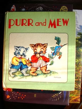
This book features a 'pastel' green background, which works in conjunction well with the red text. If I decide to use text on my front cover, I will need to match the text colour up with the background colour.

http://thumbs3.ebaystatic.com/d/l225/m/mu9IXWC4yEZwn8li92jARow.jpg < image reference at this link
Like the first example I assed to the blog, it's interesting to see a similar connection to the image previous. Again, a white background, with a simple (but this time sponge textured) pastel tone, and an illustration in the middle.


http://i.ebayimg.com/00/s/MTQwMFgxMTIy/$T2eC16JHJGwE9n)ySdEoBQ9CsGpjRw~~60_35.JPG?set_id=880000500F < image reference at this link.
Thought I'd include this book cover in this blog. Interestingly it's a Japanese children's book, with similar 1950's themes to the american and european counterparts. Its interesting to see how different cultures have used a very similar theme.

http://media-cache-ec0.pinimg.com/236x/0e/f4/d9/0ef4d954e329d719669201a4aa9ac239.jpg < image reference at this link.
This book cover illustration features very simple colours, and a minimalist background.

-----------------------------------------------
Research review:


  • In all of the examples I have displayed, the main text body seems to be at the top of the book. This is interesting, so I will reflect on this by placing my book title at the top of the book. there are many different fonts that each over uses, but one that stands out to me most, is the top one. This font type is very very similar to the times new roman font of today. However this text type is too bland for my liking, so I will try to emulate a different style. I will research font in a later blog, and go from there.

  • I have also noticed that most of my example book illustrations are roughly centred. I will emulate this by placing my book cover illustration, in the middle of the front cover page.

After going over my research, I have come up with a draft, that I could use as a basis for my book cover design. (Below)


I took into account a common theme, by seeing what was common in my random examples, and putting together a draft of what I could do for my front cover. I think it reflects 1950's children's books well, and I am looking forward to adapting on this.


Thomas.

Wednesday, 4 December 2013

Development Trial #5 (Chalk Pastels)

For my fifth development trial, in which I am experimenting with using different mediums to produce sample illustrations, I decided for this piece to be consisting of coloured chalk pastel. I tried sketching a canine, but with chalk, I find it hard to add detail, so I tried using a very thin felt pen, to add some basic fur like texture, and to go around parts of the lineart, that the chalk missed.


I generally dislike using chalk, or pastel like materials of any kind, however I wanted to keep an open mind with my research, and just see how it feels working with materials that are outside of my comfort zone.

First off, I have found the experience of using chalk pastel, to be very frustrating. I love the deep colours, and the fact you can blend multiple shades together, chalk is a great material for shading. However the substance is far too messy for my liking, and one accidental smudge can ruin a piece, that maybe you have spent a great deal of time on. Once pastel is on the paper, or other material, you cannot remove it, and this makes even simple mistakes, an absolute mark on the image. Apparently a substance called 'putty rubber' removes some chalk staining, but it is never going to be 100% removed, there will always be a mark.

I love how the chalk produces thick and bold lines, but they tend to be quite rough, and although I like rough lines, chalk just doesn't do justice for me, or in my opinion, my work. I have decided, that I will not adapt chalk further, into a developed final piece.


Thomas.

Tuesday, 3 December 2013

Development Trial #4 (Oil Pastels)

For my fourth development trial, that involves using different media to create samples of animal illustration, I decided to try out using oil pastel to draw with.


I decided to sketch out another peacock bird, and arranged the animal into the shape of the letter 'k'. I initially finely sketched the outline out on paper, and then went over it with the oils.

I found working with oil pastels, to be very difficult. They didn't offer me much in the way of precision, and accuracy, something which I love to have when making illustrations, as I love the control over line and tone. I would say however, that using oils really took me out of my comfort zone, and I just do not feel using this medium worked well. Using a medium that I generally dislike to use, might not be beneficial to me, as I like to have fun when I draw, as I always produce better results that way.


Thomas.

Development Trial #3 (Coloured Pencil)

For my third development trial, I decided to experiment with another medium, that contains 'pastel' like colours. This medium is coloured pencil.

This development illustration carries on my theme, of using animals that are sketched and displayed in a hybrid style, of 1950's children's illustration, and my own personal style. I will be using a 1950's colour palette in all of my developments, and final pieces.

This animal that I have sketched is of a Leopard Gecko. I took inspiration from my animal and digital unit.

I am really pleased with how this illustration has turned out, the colours resemble 'pastel' colours, and the patterns are spot on, and I will adapt this image further, and maybe turn it into one of my refined final pieces. it is my favourite development piece so far, I really enjoyed making this.

Coloured pencil was really easy to work with, and fun, however it was harder to get an even tone, due to the way graphite is, giving a kind of 'scratchy' look. Mainly because every time I sharpened my pencil, the tone of the point changed.
So far, out of the three developments I have made, I have to say watercolours was the one that I enjoyed creating the most, as I can get any tone I want, and if I use a thicker brush, I can get an even fill of colour.


I used a small range of colours, that matched the 'pastel' colour scheme. The reason why this colour scheme is so important, is because I have noticed that some 1950's children's illustrations, contain colour shades that fit closely with this wheel below.

http://www.joshuakeenes.co.uk/blog/wp-content/uploads/2013/05/pastel_midring_3.09-1.jpg < image reference at this link.

http://www.blogger.com/blogger.g?blogID=1545632777560021951#editor/target=post;postID=4926605380167013626;onPublishedMenu=posts;onClosedMenu=posts;postNum=4;src=postname < Link to my blog, explaining 50's illustration colour.


Thomas.

Monday, 2 December 2013

Media experimentation

Now that I believe that I have identified the colour palette to go with, I will be experimenting with mediums now. Here are a list of some the mediums I can work with, that would fit the colour palette I need to work in.

• Coloured Pencils
• Oil Pastels
• Chalk pastels
• Watercolours
• Acrylic Paint

I will select the best one, or possibly two, to work with on a minimum of 6 final pieces.

I will post images of my samples below, on each media, updating as I go along with my progress. I will take time on my developments, to get a better idea of what prolonged use of each media, feels like, and ends up as.

-----------------------------------

1) Coloured Pencil: (Gecko made with coloured pencils, arranged into the latter 'a').


2) Oil Pastel


3) Chalk Pastel (Sketchy dog made from coloured pastels, arranged into the letter 'O')


4) Watercolours (Peacock made with watercolour paints, arranged into the letter 'F').


5) Acrylic paint


Thomas.

Development Trial #2 (Watercolour & Pen)

This second development trial I have created for this book project is of a peacock bird, that I attempted to create in a hybrid style of 'vintage' elements of a 50's style, and my own personal style. This animal is shaped to resemble the letter 'F'.


I created this image using various shades of 'pastel' colour, with watercolour paint. I tried my best to copy the feathers 'wiry' texture, and also while sticking to the pastel colour wheel, that I was picking colours from.
As you can see, I used a lot of dark 'pastel' blues, and some darker shades of green. I went around certain areas using a thin, black fineliner, which I think adds to the 'retro' 50's style of illustration.

http://www.peacelovesmart.com/wp-content/uploads/2012/04/pastel_midring_3.09-1.jpg < image reference at this link. I edited this image, just placing a line around areas of the wheel, that I used most colour from.
The above image is a reminder about the 'pastel' colours that I am sticking to, for this unit.


http://img0.etsystatic.com/004/0/5051962/il_340x270.379284798_kgb1.jpg < image reference at this link.
I took some inspiration from this 1950's children's illustration. I like how various colours in the fur, make up the detail, and also provide depth. I tried to use the same technique, by using multiple colours, and lines, to give the peacock some texture.

http://img1.etsystatic.com/021/0/5744016/il_340x270.490582217_jw56.jpg < image reference at this link.
As well as the image above, I took some inspiration from this illustration on the front of the book entitles "Birds to Colour". Note the brush strokes on the bird's wing, and back. I tried to emulate this usage of 'layered lines' to build up a texture and tone.

I may adapt this piece further, to be turned into one of my refined finals.


Thomas.