Showing posts with label of. Show all posts

Tuesday, 31 December 2013

Book assembly styles (Binding types)

I have been researching some good, and professional ways in order to bind my book, and it's pages together, and I have found two styles that interest me most. The two styles that I wish to explore, are as follows.

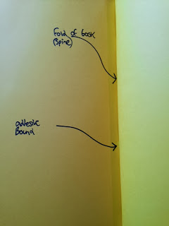
Perfect Bind: For this trial, I have used a perfect (otherwise known as adhesive) bind technique. This techniques involves binding a cover and pages together by using a single spine with an adhesive solution. The spine holds all of the pages intact, in a similar fashion to the stitching method. However lacking the need to use needles and thread. If done properly, perfect bind techniques can be more stable, and secure than their stitch bound counterparts.

My perfect bound trial, 12 hours after production.

My trials did not go so well. I used a card spine, and PVA glue to attach the book together. I found the trial to be very messy, the PVA glue leaked over the edges of the spine when I placed pressure on the book in order to make sure that the spine stayed stuck onto the pages it was holding in. It is hard to gauge pressure, so this was tricky. Because of this leakage, some parts of the card were discoloured, torn, and were left with patchy areas of glue, that is highly unwanted, especially for a professional looking book.

Messy sections, that was caused by PVA leakage, and pressure.

Another problem with the trial was that the pages didn't open out naturally in the way books are supposed to. I think I made the spine a bit to wide, and this trapped the pages, stopping them from opening in the desirable way.

The spine issue, caused by making the card spine too wide.

The inside of my perfect bound book trial, detailing key elements of the perfect bound style. I will hand this book in as part of my development, to go with this unit.

As well as this perfect bind made using card, I also made one using paper, with similar issues, like the card example above.


Front cover.

Side, you can see unpleasant warping.

Again, the spine was too wide, trapping paper.

More extreme warping, later on.

http://printwiki.org/Perfect_Binding < Link to an interesting article, discussing perfect binding.


Stitching: For this trial, I have used a needle and thread to stitch a small sample book, with some pages together.
This technique involves simply using a needle and thread, to stitch the paper or card together like how you would stitch fabric.

Folded paper pages, ready to be stitched together

This technique can be trickier than perfect binding in some ways, for example in the way that the placement of the needle has to be very precisely in the centre of the paper fold. One missed entry location, and the thread can visually look uneven, and this is not wanted. Also the thread can come through the needle hole, if the knot isn't large enough. As a health and safety aspect, you can also injure yourself with a sharp needle, quite easily. This needs to be taken into account.

Precisely measured out marks, to indicate the entry and exit holes that the needle will go in and out, and also displaying the gap in which the thread will be placed.

The needle and thread being initially placed into the paper.

The stitching trial underway.

The finished stitching trial, with the loose thread and hanging needle still being required, to be removed from the sample book. You can see the knots in the thread, which are stopping the string from falling back through the holes.

My finished trial, with loose thread removed. Here I detail key elements of the binding technique, in the physical book. I will hand the book in as a development, to go with this unit.


---------------------------------

For the binding of my final book, I have decided to use a stitching technique, in order to securely bind together my book and it's pages. The reason for this, is because I found using stitching in my trials to be quicker, (lack of wait time for drying) and also slightly more tidier than using a perfect bound book, in my opinion. I will attach the front cover to the pages using spray mounting glue.

My needle and thread stitching, to bind the books pages together.

I took what I learnt from the stitching trial, and brought it into use for my final book assembly. I believe I did this well. Creating trials really did help me get an insight into book creation.


Thomas.


Monday, 9 December 2013

Development Trial #6 (Acrylic paint)

For my sixth developmental trial, I will be sticking to using mediums that create a very 'pastel' like tone, since I noticed way back in my research on 1950's children's illustration, that most illustrations contain colours that resemble a range from this wheel.


http://www.joshuakeenes.co.uk/blog/wp-content/uploads/2013/05/pastel_midring_3.09-1.jpg < image reference at this link.


I decided to paint a tree, notably the christmas tree outside the campus, since it's right on the 'doorstep'.
I began sketching the outline with a fine pen, and then added a dark shade of acrylic paint to the image. I then began adding lighter shades of green, to give the illustration tone, depth, shadow and lighting. This build up was to help make the tree look realistic, but with that cartoon like element that 1950's contains.


I found using acrylic paint to be difficult to blend. However despite this, it had a great, strong colour about it. Also because it is paint, any colour can be mixed and created. This gives materials such as paint, a good reason to use.


Thomas.

Friday, 6 December 2013

Media choice

After producing development illustrations where I used mediums that emulated my chosen colour choice, I have decided that there were two mediums that stood out. The best mediums to go with in my opinion, are the following below. I will go into depth with them also, and detail an example of my work.

Coloured Pencil: I really like the colour range that coloured graphite provides, providing I pick the right pencil shade, and also the selection of pencils, as every box has slight variations in the colour. With the right selection, it is very accurate toward my chosen palette of using 'pastel tones'. (The reason I want to use this 'pastel' colour scheme, is due to the relationship between 1950's illustration, and these tones. I found out through research that 1950's children's illustration, uses a lot of 'pastel' like tones). I found this medium emulated this tone well.
To avoid the 'sketchy' pencil look to the texture, I could utilise watercolour pencils, which would blend together, similar to the medium that I detail below. Naturally I prefer using coloured pencil to say oil pastels, so I feel the more comfortable I am with the medium, the better the work I produce.

My development trial using coloured graphite.


Watercolour: I found using watercolour a fun experience, and I found myself to be really enthusiastic when using them. Also, the colours the medium provides, can be very accurate toward the 1950's children's illustration palette of 'pastel tones', so long as I mix the right shades. And I loved how I could create any shade, of any colour with this medium, so watercolour offers a much larger range of colour than coloured pencils can allow. Watercolour also blends together better than pencils, and lacks that typical scratchy graphite appearance to it. I also simply love how using watercolours feels, the motions of the brush, and how watercolour paintings tend to have that recognisable look about them, watercolour is a very distinct medium.


My development trial using watercolour.


Thomas.

Wednesday, 4 December 2013

Development Trial #5 (Chalk Pastels)

For my fifth development trial, in which I am experimenting with using different mediums to produce sample illustrations, I decided for this piece to be consisting of coloured chalk pastel. I tried sketching a canine, but with chalk, I find it hard to add detail, so I tried using a very thin felt pen, to add some basic fur like texture, and to go around parts of the lineart, that the chalk missed.


I generally dislike using chalk, or pastel like materials of any kind, however I wanted to keep an open mind with my research, and just see how it feels working with materials that are outside of my comfort zone.

First off, I have found the experience of using chalk pastel, to be very frustrating. I love the deep colours, and the fact you can blend multiple shades together, chalk is a great material for shading. However the substance is far too messy for my liking, and one accidental smudge can ruin a piece, that maybe you have spent a great deal of time on. Once pastel is on the paper, or other material, you cannot remove it, and this makes even simple mistakes, an absolute mark on the image. Apparently a substance called 'putty rubber' removes some chalk staining, but it is never going to be 100% removed, there will always be a mark.

I love how the chalk produces thick and bold lines, but they tend to be quite rough, and although I like rough lines, chalk just doesn't do justice for me, or in my opinion, my work. I have decided, that I will not adapt chalk further, into a developed final piece.


Thomas.

Tuesday, 3 December 2013

Development Trial #4 (Oil Pastels)

For my fourth development trial, that involves using different media to create samples of animal illustration, I decided to try out using oil pastel to draw with.


I decided to sketch out another peacock bird, and arranged the animal into the shape of the letter 'k'. I initially finely sketched the outline out on paper, and then went over it with the oils.

I found working with oil pastels, to be very difficult. They didn't offer me much in the way of precision, and accuracy, something which I love to have when making illustrations, as I love the control over line and tone. I would say however, that using oils really took me out of my comfort zone, and I just do not feel using this medium worked well. Using a medium that I generally dislike to use, might not be beneficial to me, as I like to have fun when I draw, as I always produce better results that way.


Thomas.

Craww & Mr Millerchip

Today, two very talented illustrators came into the illustration studio, one was called Craww, who created reportage like illustrations. And the other was Mr Millerchip, a very fun illustrator, who sketched such things as people, and used a lot of theme in his illustrations. The two illustrators came into the studio today, in order to give us some very useful and interesting information on such things, as how the industry works, how they got into illustration, and how they rose up to where they are now. They both provided great, detailed answers to questions that the class raised.

Craww handed out sketchpads of some of his work, which was passed around the room, after a lengthy PowerPoint on his favourite pieces, and he told an interesting background story, on each piece he displayed. 

I spent a while looking at two of his books, and I was really impressed by his artwork, that was inside his moleskin books. They seemed to be a cross between reportage, and abstract artwork, as he sketched such things like people, particularly of the femal form, and he used very abstract, and almost 'scratchy' lines. This is something that grabbed my attention, as I already love this kind of illustration style.

Mr Millerchip, went around the studio, and talked to students about their work. He came to me twice, and I had a discussion with him, about what I was trying to achieve with this unit task. He seemed very interested in what everybody was doing, and he gave off an enthusiastic vibe. After this, he gave his own PowerPoint, on his early life, how he was influenced to become an illustrator, and what inspired him. He also noted some mistakes he made early on in his career, and warned us about the dangers of contracts, and false promises given by companies to fresh university graduates. 

Both illustrators were great, and I'm really happy I had the opportunity to listen to their very useful information. I will be following them on a various number of sites, as not only was I impressed by their work, but also their personalities, stories and characters.


Thomas.


Monday, 2 December 2013

Media experimentation

Now that I believe that I have identified the colour palette to go with, I will be experimenting with mediums now. Here are a list of some the mediums I can work with, that would fit the colour palette I need to work in.

• Coloured Pencils
• Oil Pastels
• Chalk pastels
• Watercolours
• Acrylic Paint

I will select the best one, or possibly two, to work with on a minimum of 6 final pieces.

I will post images of my samples below, on each media, updating as I go along with my progress. I will take time on my developments, to get a better idea of what prolonged use of each media, feels like, and ends up as.

-----------------------------------

1) Coloured Pencil: (Gecko made with coloured pencils, arranged into the latter 'a').


2) Oil Pastel


3) Chalk Pastel (Sketchy dog made from coloured pastels, arranged into the letter 'O')


4) Watercolours (Peacock made with watercolour paints, arranged into the letter 'F').


5) Acrylic paint


Thomas.

Development Trial #2 (Watercolour & Pen)

This second development trial I have created for this book project is of a peacock bird, that I attempted to create in a hybrid style of 'vintage' elements of a 50's style, and my own personal style. This animal is shaped to resemble the letter 'F'.


I created this image using various shades of 'pastel' colour, with watercolour paint. I tried my best to copy the feathers 'wiry' texture, and also while sticking to the pastel colour wheel, that I was picking colours from.
As you can see, I used a lot of dark 'pastel' blues, and some darker shades of green. I went around certain areas using a thin, black fineliner, which I think adds to the 'retro' 50's style of illustration.

http://www.peacelovesmart.com/wp-content/uploads/2012/04/pastel_midring_3.09-1.jpg < image reference at this link. I edited this image, just placing a line around areas of the wheel, that I used most colour from.
The above image is a reminder about the 'pastel' colours that I am sticking to, for this unit.


http://img0.etsystatic.com/004/0/5051962/il_340x270.379284798_kgb1.jpg < image reference at this link.
I took some inspiration from this 1950's children's illustration. I like how various colours in the fur, make up the detail, and also provide depth. I tried to use the same technique, by using multiple colours, and lines, to give the peacock some texture.

http://img1.etsystatic.com/021/0/5744016/il_340x270.490582217_jw56.jpg < image reference at this link.
As well as the image above, I took some inspiration from this illustration on the front of the book entitles "Birds to Colour". Note the brush strokes on the bird's wing, and back. I tried to emulate this usage of 'layered lines' to build up a texture and tone.

I may adapt this piece further, to be turned into one of my refined finals.


Thomas.

1950's Colour Palette

In 1950's illustration, drawings and prints had a very distinct palette of colours. I have noticed that some colours, to me, seem to have areas where the colour is exaggerated, and areas where the colour is not so much. Some 50's illustrations also include a slight 'hue', to my eyes.

http://images.bridgemanart.com/api/1.0/image/600wm.ADV.7858930.7055475/395408.jpg < image reference at this link.
This image above, is a great example of the use of colour in 1950's style illustrations. This image in particular features really strong oranges, blues blacks.

Over my research, I have noticed that these 1950's illustration tones, almost resemble coloured pastel tones. An example of pastel tones can be seen below, as this colour wheel demonstrates the various pastel shades of each colour.
http://www.joshuakeenes.co.uk/blog/wp-content/uploads/2013/05/pastel_midring_3.09-1.jpg < image reference at this link.

 This 'pastel tone style' seems to be repeated across the genre, as I prove in the following example images below.

http://bluebirdsunshine.files.wordpress.com/2012/11/birds.jpg < image reference here at this link.
Note the smudging of the grey on the bird's backs.


http://img1.etsystatic.com/022/1/7172827/il_340x270.493626587_ncjj.jpg < image reference at this link.

Compare the pinks and greens on the children's shirts, to the colour wheel.


http://media-cache-ec0.pinimg.com/236x/a2/37/1a/a2371a91a3209d3373fdd524ad3a7243.jpg < image reference at this link.
Compare the colours in this illustration, to the colours in the colour wheel.


https://blogger.googleusercontent.com/img/b/R29vZ2xl/AVvXsEh2tRXu5P_B4uySA9P2uiVq5uB48J0nqoLAf_RKF0b-8AnPKsJc51mlOkc-kN4xtghXiH9wuxIumUfq-JzJu6A8cQXXqtQv422qHE7n3QKeR70iVDE5ieJci1dBULC1TPCypURQ_NmFfFs/s640/il_570xN_250529960.jpg < image reference at this link.

Compare the blues on the image with the the pastel colour wheel above.


It is in my conclusion, I have decided that using pastel-like tones in my illustrations would, on the basis of this research, be the best colour to use, in order to get an accurate colour style of the 1950's.

I might try using chalk, and oil based pastels, some coloured pencils, and paint might work too, as long as I stick to the palette.


Thomas.

Sunday, 1 December 2013

Final Pieces Background

For each of my 6 final pieces, that I will include in the six illustrations inside my book of drawings, I would like to include a background. The background that I believe will fit more with the illustration style that I have chosen, is the style of 50's children's illustration theme, coupled with elements of my own personal style, in order to create something that appears unique.

I was thinking something like using simple colour backgrounds, with a combination of other various items, such as small 'doodle' like illustrations to 'split' the background up a bit, and to make the image seem a bit more appealing for the eye.

http://comps.canstockphoto.com/can-stock-photo_csp6488475.jpg < image reference at this link.
As you can see in the image above, the piece includes a background, that is consisting of colour, split into 4 parts. This piece is a bit too cartoon like for the pieces I will be creating, but it shows that such a simple style, can have such an effect on the entire piece. In this case, it allows the characters to stand out more, and also I have noticed, that the colours used in this background, go well with the faces that are in the piece. So background colour matching is an important thing to keep in mind, with an illustration in colour.

http://wolfandwillow.typepad.com/.a/6a0120a6a93724970b012876221bb6970c-800wi < image reference at this link
Some illustrations using 50's style, use simple colours as backgrounds. Like for example this illustration above, that is more like the drawing style I wish to create in my finals. I have noticed this style of background use a lot, with pieces in this genre. I could for example place an illustration onto a coloured background, and simply add other drawings alongside them, for example, drawing a rattle next to a rattlesnake, a ball next to a dog, or a carton of milk next to a cow. This idea is very fun and quirky, and will make my pages that bit more interesting

For my first draft, (which was of the snake I created two days ago), I will be adding some colour tomorrow, so I will also experiment with background colour and styles then.

I will update this blog then.

Update:
I have decided to go with using simple colour backgrounds, and using 'quirky' illustrative doodles and drawings, that are themed to the animal(s) on each page. The doodles will of course also be in 1950's children's illustration style.

An example of illustrations, against a themed simple colourful background, with some leaves.


My Cat illustration, with some themed items around it. (Unfinished)

My Canine illustration, again with themed items around it. You can see the colourful background behind.


Thomas.

Saturday, 30 November 2013

John Abbot Nez (50's Style Illustrator)

John Abbot Nez, is a children's illustrator, who creates pieces that resemble the 1950's style of children's illustration for books and print. He interestingly tries to combine the 1950's retro style, with a digital style. He often looks at what he calls 'amazing' artists of the 1950's, whose style of work seems to fit in the modern era.

I place a quote from his site below, that I want to detail word for word, as it is a very interesting point in my opinion, that he gives.

"I was looking through magazines from the 1950's and found some amazing samples of Alice and Martin Provensen's illustration work from the 1950's.  It still looks very contemporary.  Maybe that's because 1950's design seems so similar to our own decade... or maybe it's just a timeless classic.  Of course they didn't get to use digital tools to embellish their amazing designs, but I guess their work will last the ages."

The fact that he claims 1950's illustrations are similar to illustrations styles in this era, raises a good point. Since hearing this, I have realised this too, the amount of similarities you can see between these two different eras are striking. I will show this below, with examples to back my argument up.


(1950's children's illustration)
http://media-cache-ec0.pinimg.com/236x/a2/37/1a/a2371a91a3209d3373fdd524ad3a7243.jpg < image reference at this link.


(2010 children's illustration)
http://graphics8.nytimes.com/images/2010/11/04/best-2-slide.jpg < image reference at this link.

As you can see in these comparison images blow, the top one is from the 50's, and the bottom one is from the 2010 era. These two images are very similar, in terms of style, and technique. You can see obvious similarities in such things as the rosy cheeks, the colour and the simple textures.

His art style is based on a pen brush line, that is drawn onto textured watercolour paper. He tries to make his colours bright and bold, which are staples in the 1950's illustration themed style. He then combines traditional with the digital format, and adds texture and pattern on adobe photoshop.

http://www.childrensillustrators.com/illustrator-details/JohnNez/id=1504/slideshow/pag=11/ < image reference at this link.
Here is an example of John's illustrations. In this case, of two cats. This shows his 50's influenced artwork style, and how he uses texture, colour and lines to do this well.

For his work he uses the following software packages of photoshop, Indesign, Acrobat, Illustrator and GoLive, and with a mac pro desktop computer and a wacom tablet, a digital camera, two desktop cinema displays for a wide canvas when drawing. These types of equipment seem to be standard for each illustrator that I research, most of this equipment also accounts for my own personal ventures as an artist.

------------------------

http://www.childrensillustrators.com/illustrator-details/JohnNez/id=1504/portfolio/ < a link to where I got the information on him, and also a link to his online portfolio.


Thomas.

Friday, 29 November 2013

Development Trial #1 (Graphite pencil & Watercolour)

For this development trial, I spent a bit extra time on creating an example, of what I would be doing for my book of illustrations project.

'S for snake', is the general idea behind this illustration.


The piece needs a little bit of extra refinement, so that it copies better under a scanner, however I am quite pleased with how the image turned out.

I will add some colour using watercolour mainly.


-------------------

Update: Colour added through using fine, weak watercolours. (Image below)


--------------------

Update 2: Added a bolder line, around the snake's body, using a fineliner.

Update 3: Added some chalk pastel shading, but regret doing so, as the chalk 'ruined' the shading contrast. however, since it is all part of my development, I suppose I learn from my mistakes.


Thomas.

Thursday, 28 November 2013

Old Children's Books/illustration Examples

In my house, while searching for some old fashioned books that might contain depictions of old children's style illustrations, I found a few old children's books dating between the 1950's, and the 1960's.

In these books, the illustrations both inside and out, match the images from the research that I did on an earlier blog post, on children's illustration for the 1950's.

> Link here: http://www.blogger.com/blogger.g?blogID=1545632777560021951#editor/target=post;postID=8659642854686731477;onPublishedMenu=posts;onClosedMenu=posts;postNum=3;src=postname

I will be particularly focusing on the illustration of animals, for this unit.

Book: Wagon Train, front cover, Author: Maurice Templar, Illustrated by R. Wilson

Book: My Favourite Story Book, front cover, Author: ?, Publisher: Treasure House Books

These two books both depict perfect examples of 'vintage' children's book illustration. I would like to address the images below, which is a zoomed section of the second image, that I added above.


In this image, it shows how certain animals were sketched, (in this case what appears to be a dog puppy) in a style adapted for children. Note the very colourful style, and the black bold lines.


All black and white styled images above are from the book entitled, My Favourite Story Book, which was published by Treasure Hour Books.


The images above are old illustrations in black and white form. They are all from the same book, which I referenced above. I really love this style of sketching, and I could look into allowing my work to reflect this, for this book of drawings. It is a combination of cartoon/realistic themes, which I adore. I would like to bring some colour into my pieces though however.


I will try to find more books, if I can soon, and if I do I will update this blog.


Thomas.